The increase of people using mobile and tablet devices to view web content has meant that user expectations of website design has changed.
What is a Responsive Website Design?
The increase of people using mobile and tablet devices to view web content has meant that user expectations of website design has changed. People expect to be able to browse website content on these devices just as easily as they can on their desktop computers.
One solution, which has been popular in recent years, is to effectively design two sites, one for desktop computers and one for mobile devices. An alternative solution is to create a ‘responsive’ website that understands what device it is being viewed on, and what the device is capable of. Responsive Web Design uses flexible images and fluid grids, to fit correctly to the screen. With the spectrum of screen sizes and resolutions widening everyday, it is understandable why Responsive Web Design is becoming more and more relevant.
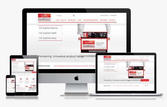
Responsive Website Design layout
Responsive website design is usually a combination of fluid stretchy containers, and breakpoints that define the difference in layout between different sized devices. Fluid gives a more consistent design which utilises the same containers at varying widths. Then breakpoints are for setting up more visually different configurations of containers depending on the available width.
RWD Design
RWD is ideally designed for mobile first, or using progressive enhancement techniques. This ensures that the more basic the device, it will still look as the design intended, then with bigger, more feature packed devices, you can enhance with different effects and techniques. Progressive enhancement opposes the usual method of desktop website builds using graceful degradation.
RWD Content
The flow of content such as copy, images, and videos is important to plan out efficiently so that when viewing on a smaller device, the most important content for the viewer to see is at the top. With limited screen real estate, strategising and condensing the content is key to make for an effective and usable site.
Who is your target audience?
It is important to understand the demographic of your site visitors when deciding if you should think about a responsive website design for your site. Is it vitally important people can browse your site while on the move? Do you already have strong mobile browser viewing statistics? Do you want people across multiple devices to have a consistent viewing experience? Some sites simply aren’t suited to, or need responsive capabilities.
Is Responsive Website Design right for me?
Responsive Web Design isn’t suitable for every website, there are many factors which you may wish to weigh up. We have compiled some of the main pros and cons to help you decide whether it is suitable for your website...
The pros of a Responsive Website Design:
• Seamlessly works across various different screens
• Ensures a great user experience on every screen
• Emerging technology, great if being forefront of technology is important to your business
• When making a change to your website, you only have to do it once
• Can improve SEO
The cons of a Responsive Website Design:
• May be unnecessary if your website is viewed mainly on desktop browsers
• Potential for longer download times on smaller devices, as still downloading all the code and media that the device uses it based on its size.
• Planning, wireframes, and design process are more complex and therefore more costly
• Some devices / browsers will not fully support RWD functionality
There is no straightforward answer as to whether a responsive website is right for your business. Our in-house experts, here at Melon, would welcome the opportunity to discuss in-depth how your website responds to the changes in how users browse the web, and how you can use it to your full advantage. Click here to contact us.
Created by Melon, an experienced, innovative web design agency near Milton Keynes.